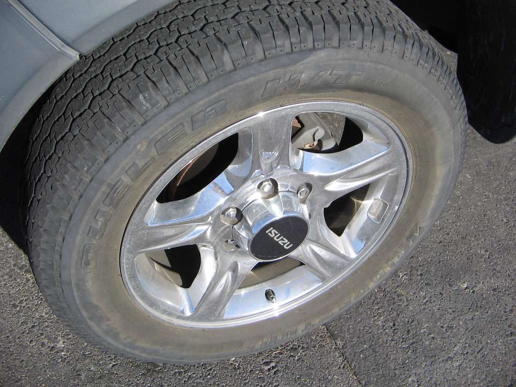
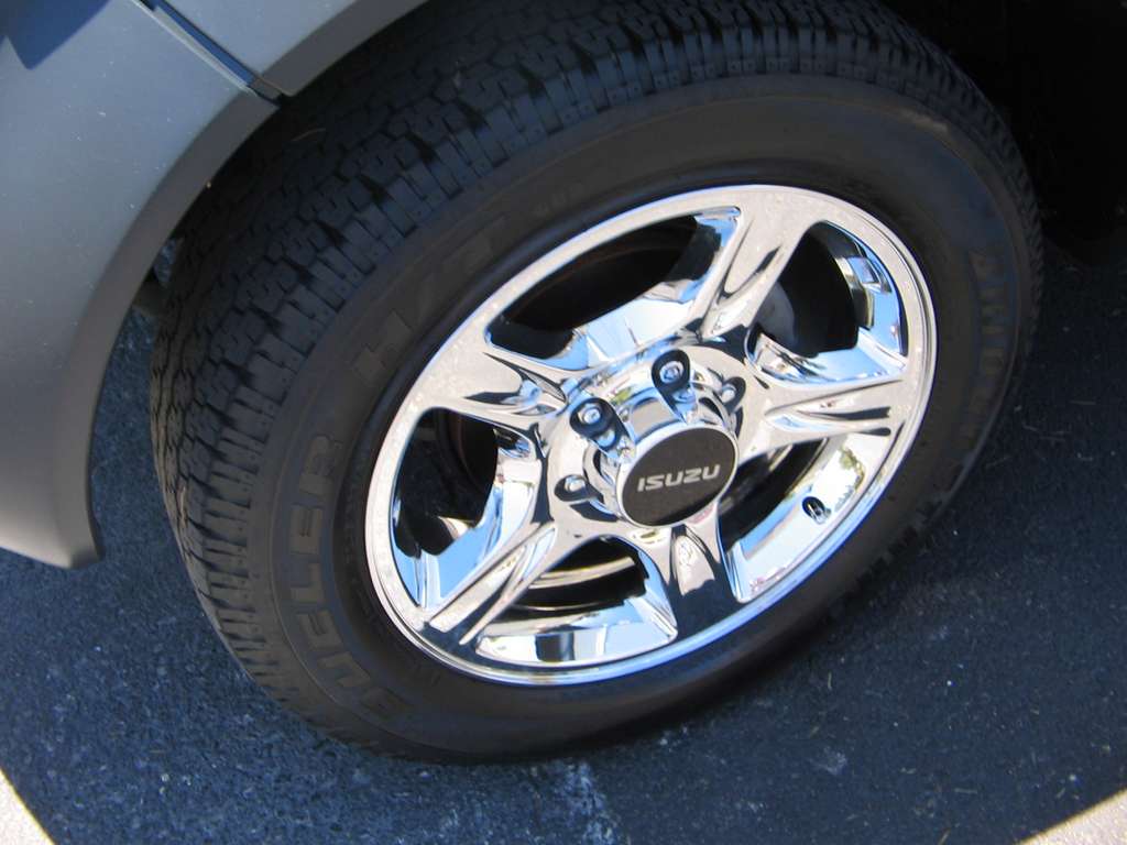
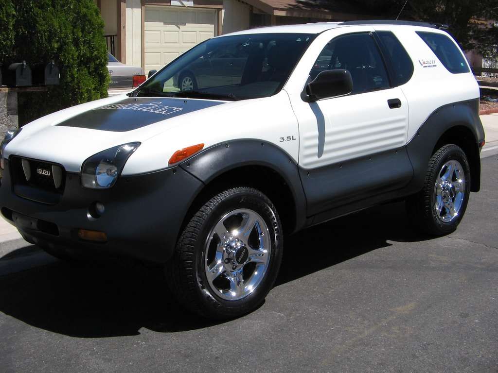
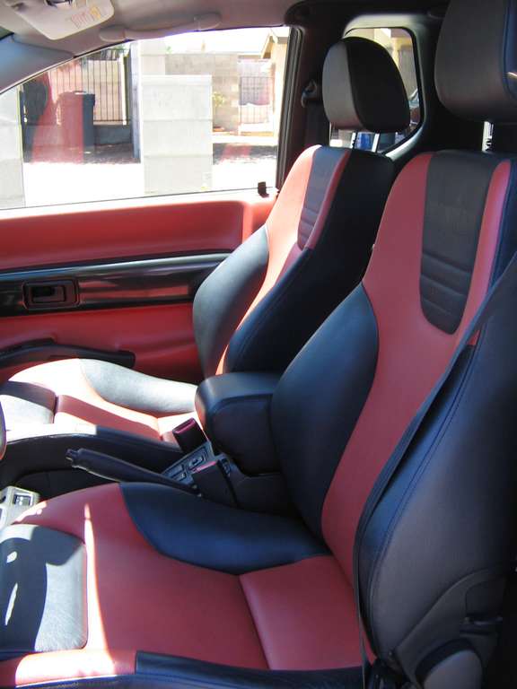
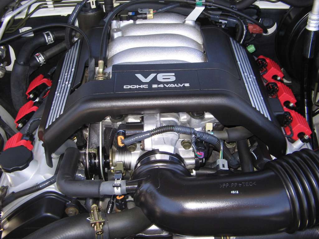
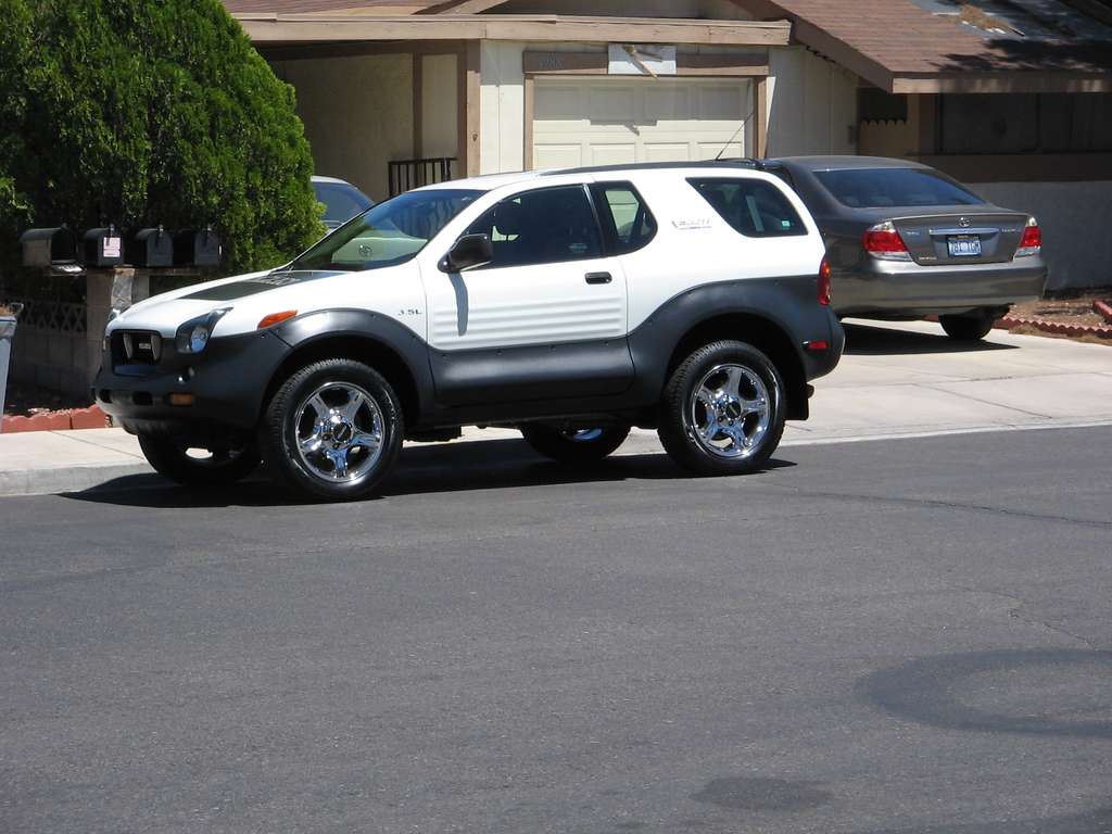
So after many weeks of sitting in the holy Moab red dust...I finally broke down and got my baby sparkling clean! I took her to an amazing detail shop...referred to me from Gill...Thanks again by the way. And they were working on Ferrari's and Lambos...etc....I handed the keys over and $400 and 5 hours later...she came back a beauty. Oh did I mention that the clients were checking out my VX over the Ferrari's and Lambo's! We Rock!!!! Check her out!!! They even did the under the hood!!! She is better than brand new!!! I am sooooo EXCITED!!!!! EEEEEKKKKKKkkk! before and after shots...


 Reply With Quote


")


 I clean her up on the weekends, by wednesday she looks just the way she was before I cleaned her up... I can't imagine paying $400 for any car wash